- Documentation
- 1 - Start Here
- 2 - Indicators
- 2.1 Future Pivots
- 2.2 - WaveTrend
- 3 - Tools

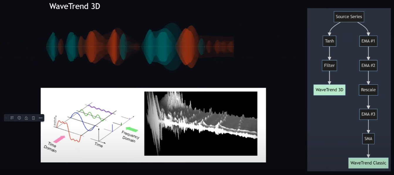
Wavetrend 3D - Introduction
The WaveTrend 3D indicator is an advanced version of the traditional WaveTrend indicator, incorporating a three-dimensional approach to analyzing market trends and potential trading opportunities across multiple timeframes. This enhanced version is designed to address some of the weaknesses of the original WaveTrend indicator, such as its limitations in identifying accurate inflection points during market transitions from ranging to trending states and its reliance on overbought and oversold conditions which may not always provide reliable signals.
The WaveTrend 3D indicator uses modern signal processing techniques, such as the hyperbolic tangent function for normalization and the Butterworth filter for noise reduction, to produce smoother and more reliable oscillators. These oscillators are then visualized in a way that emphasizes the synchronization of market movements across different timeframes, highlighting potential trading opportunities when these movements align.
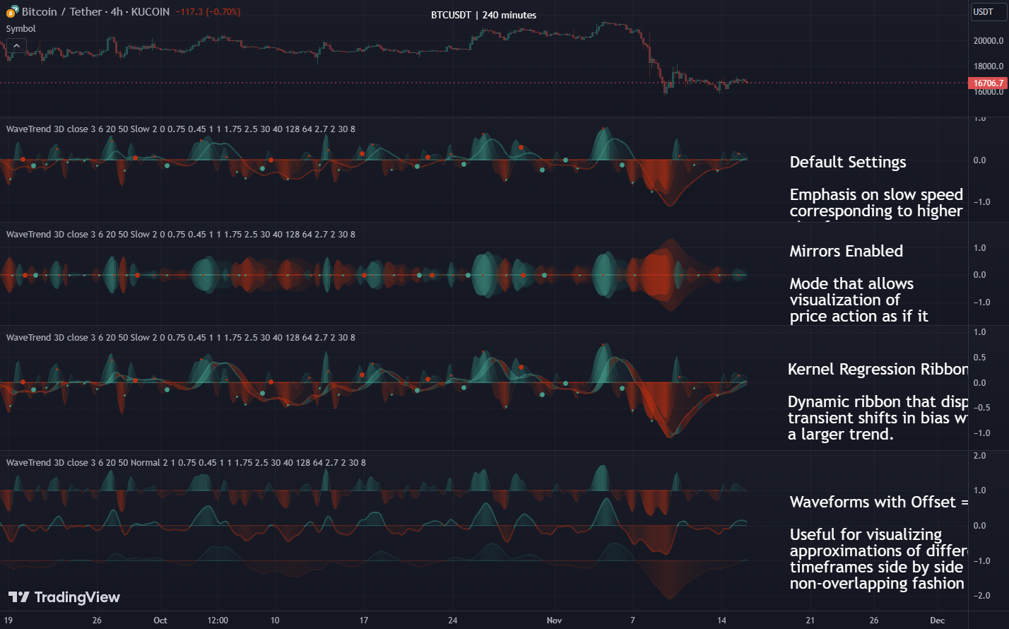
Key features of the WaveTrend 3D indicator include the ability to visualize small and big circles indicating potential market movements, mirrored mode for an alternate view of oscillator behavior, EMA (Exponential Moving Average) and CoG (Center of Gravity) smoothing options for fine-tuning the signals, and kernel estimators for reducing lag in the indicator's response to market changes. Additionally, it introduces overbought and oversold zones tailored to the 3D approach, offering more nuanced insights into market conditions.
The WaveTrend 3D indicator is thus a comprehensive tool that aims to provide traders with a deeper understanding of market dynamics and assist in making more informed trading decisions by incorporating multi-timeframe analysis into a single indicator.
WaveTrend Background
WaveTrend, or WaveTrend Classic as I refer to it, is a renowned technical indicator popular not just on TradingView but on many other platforms as well, including ThinkorSwim and MetaTrader. Originally brought to TradingView in 2014 by LazyBear, it was copied verbatim from other platforms. The indicator has become very popular, evidenced by its ranking among the top scripts on TradingView.
WaveTrend History
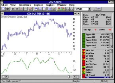
The origin of this algorithm traces back to the 1980s, created by AIQ Systems as the Trading Channel Index (TCI), designed to improve on the Commodity Channel Index (CCI). It aimed to smooth out the CCI calculation, allowing analysts to identify true inflection points more easily. Despite its origins being somewhat obscured over time, it's interesting to note that even LazyBear's original code referred to it as TCI.
WaveTrend Strengths and Weaknesses
WaveTrend (Classic) Strengths
- Good at identifying inflection points
- Good at identifying divergences
- Decent at identifying overbought and oversold conditions
One way it accomplishes this is through a mechanism that many have come to call the trigger wave approach. Any smaller wave such as this one that's preceded by a larger wave is usually an indication that this is a trigger for a massive price movement or at least a noticeable price movement. So in this case, it is indeed showing you a decrease in bullish momentum, which usually means that there's a bearish correction phase that will follow.
The last strength, which honestly I think you could think of as a weakness too because it can be pretty dangerous, but it tries to give you a sense of overbought and oversold conditions as well. So whenever there's a shift in the regime, for example, and the market suddenly goes from ranging to trending, these zones really can't be depended on very much for reliable indicators of being overbought and oversold.
WaveTrend (Classic) Weaknesses
- Unbounded extremes
The market can blast right through the red zones, and then you can continue up here for really as long as the market wants which is a scary thing; there's no actual bounded extremes and it can just continue going up, and it can stay up here for as long as it wants.
- Susceptibility to whipsaw
If the market is in a ranging state and then makes a move, you could really get faked out if you're not really paying attention to other time frames due to the whipsaw effect where you suddenly get slinged into another direction.
- Lack of insight into other timeframes
One thing that is potentially very dangerous about WaveTrend is that it is particularly weak whenever the market transitions from a ranging to a trending state. So you can easily lose track of this bigger picture if you're not careful.
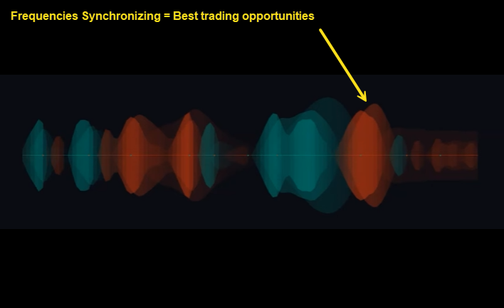
WaveTrend 3D New Approach
When we think of charts we tend to think of these two-dimensional graphs of oscillators, when in reality, they're really more like three dimensions and if you start to think of them like this, you can almost visualize a three-dimensional sound wave like I have in this graphic below.
It's really important to keep in mind the bigger picture whenever you're looking at varying frequencies across a time domain because whatever is happening in these little frequencies is not necessarily representative of what's happening at these much larger frequencies, which could carry a lot more gravity.
The best trading opportunities are identified by those rare moments when suddenly all of these frequencies start to synchronize, and that's when you get these incredible opportunities that increase these big impulse waves where you could start trading in a given direction.
WaveTrend 3D Oscillators
I want to point out one thing that I think is very important to keep in perspective, and that is the whole time frame to oscillator relationship. So here we have three different time frames: the one hour, the two hour, and the four-hour charts, all for Ethereum versus the US dollar as USDT, and a WaveTrend indicator loaded on each of these charts.

You will notice that, unlike the default settings, I purposely separated out each of these oscillators to show you what they actually are. For each of these oscillators, the top oscillator represents the fastest speed oscillator, the middle oscillator represents the normal speed, and the bottom oscillator is the slowest speed oscillator. What you will notice is that when you are on the one-hour chart, this speed is essentially the same as the normal speed on the two-hour chart. If you try to trace these waveforms, you can see that although there are some differences, they are more or less the exact same shape.
By the same token, the normal speed oscillator on the two-hour chart very closely matches the fast speed of the four-hour chart. This is a very powerful concept because it means that at any given time frame you're on, you can also keep in perspective what's happening in the surrounding time frames.
So how can you actually use this now to frame your decisions?
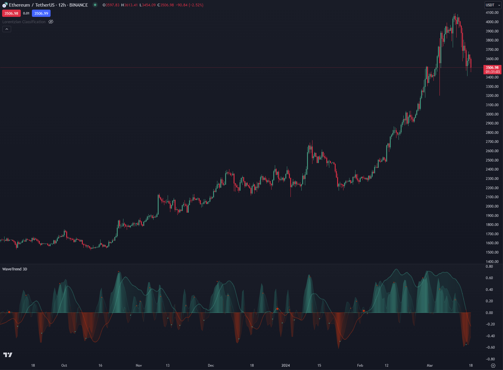
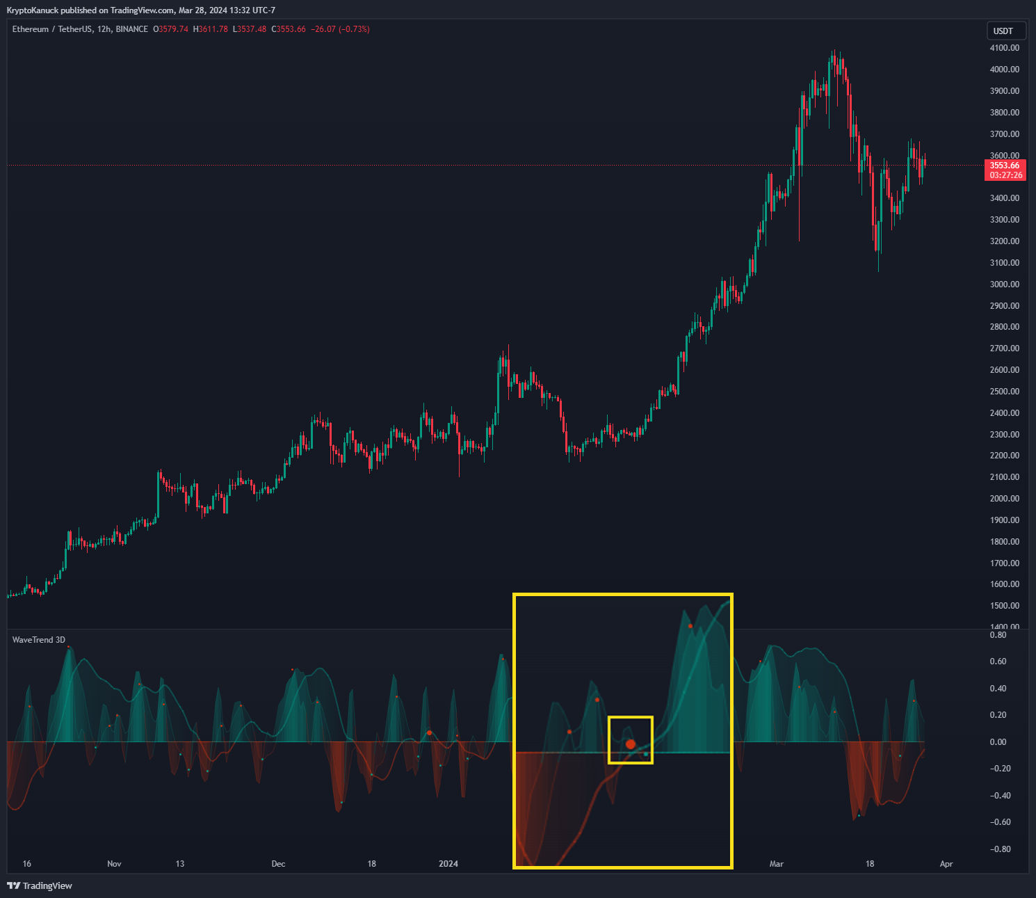
One way of doing this is to overlap these oscillators with one another which is the default setting in WaveTrend 3D. This a 12-hour chart for Ethereum. So the fast oscillator is approximately a six-hour time frame, the slow oscillator is approximately the daily time frame and the normal oscillator represents what's happening at the 12-hour time frame.
WaveTrend 3D Small Circles
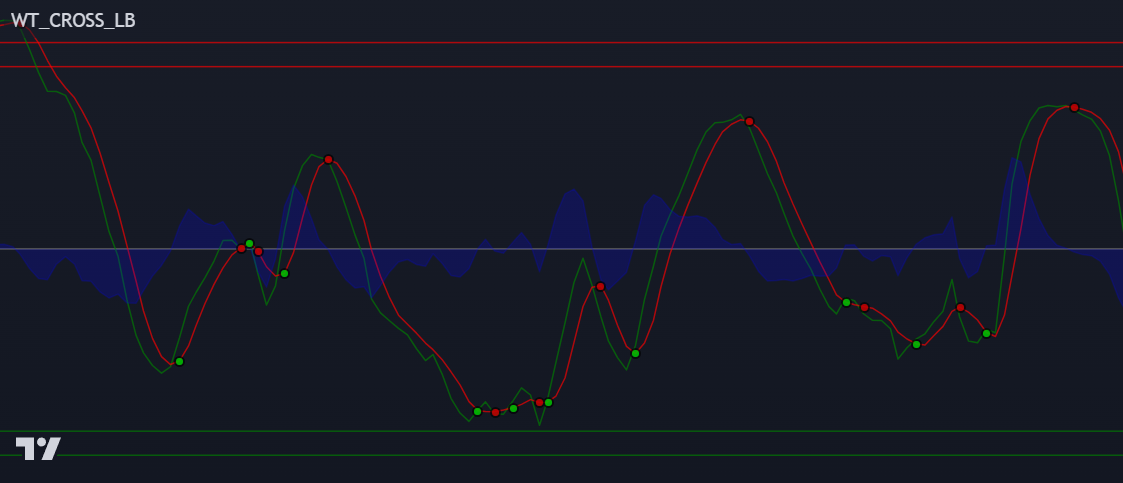
Now, of these three oscillators, the two that are the most important in terms of generating the small circle signals that you see are basically the fast oscillator and the normal oscillator. And let me select this to show oscillator line so you can see them a little more clearly. So you'll see that whenever the fast oscillator crosses down over the normal oscillator, and it's above the zero median line, that is when a small red circle is generated.
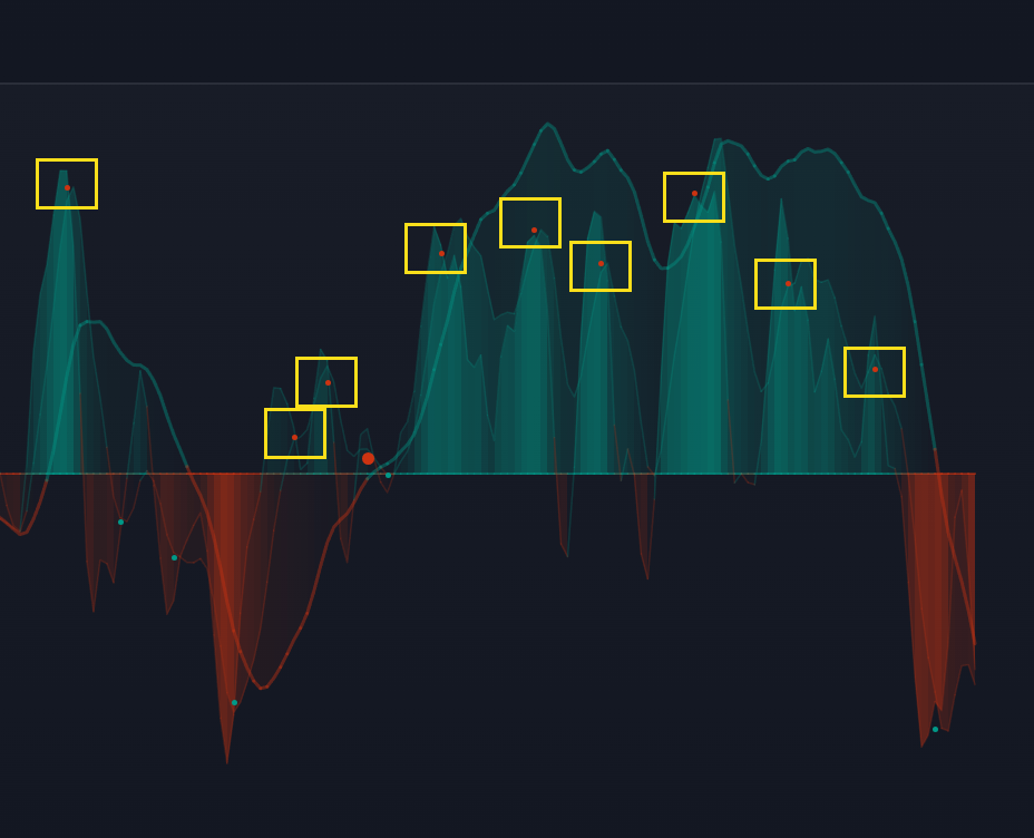
Whenever the fast oscillator intersects the or crosses over the normal oscillator when it's below the zero line, that's when it will typically generate a small green circle. Keep in mind that just because a circle is generated does not necessarily mean that price will just go flying off in that direction.
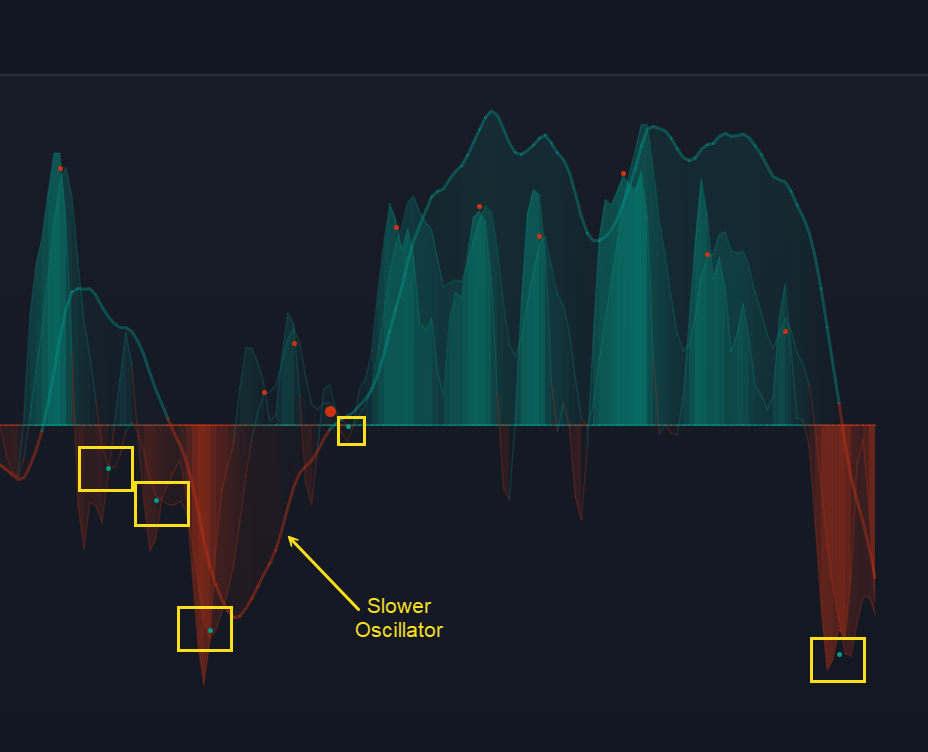
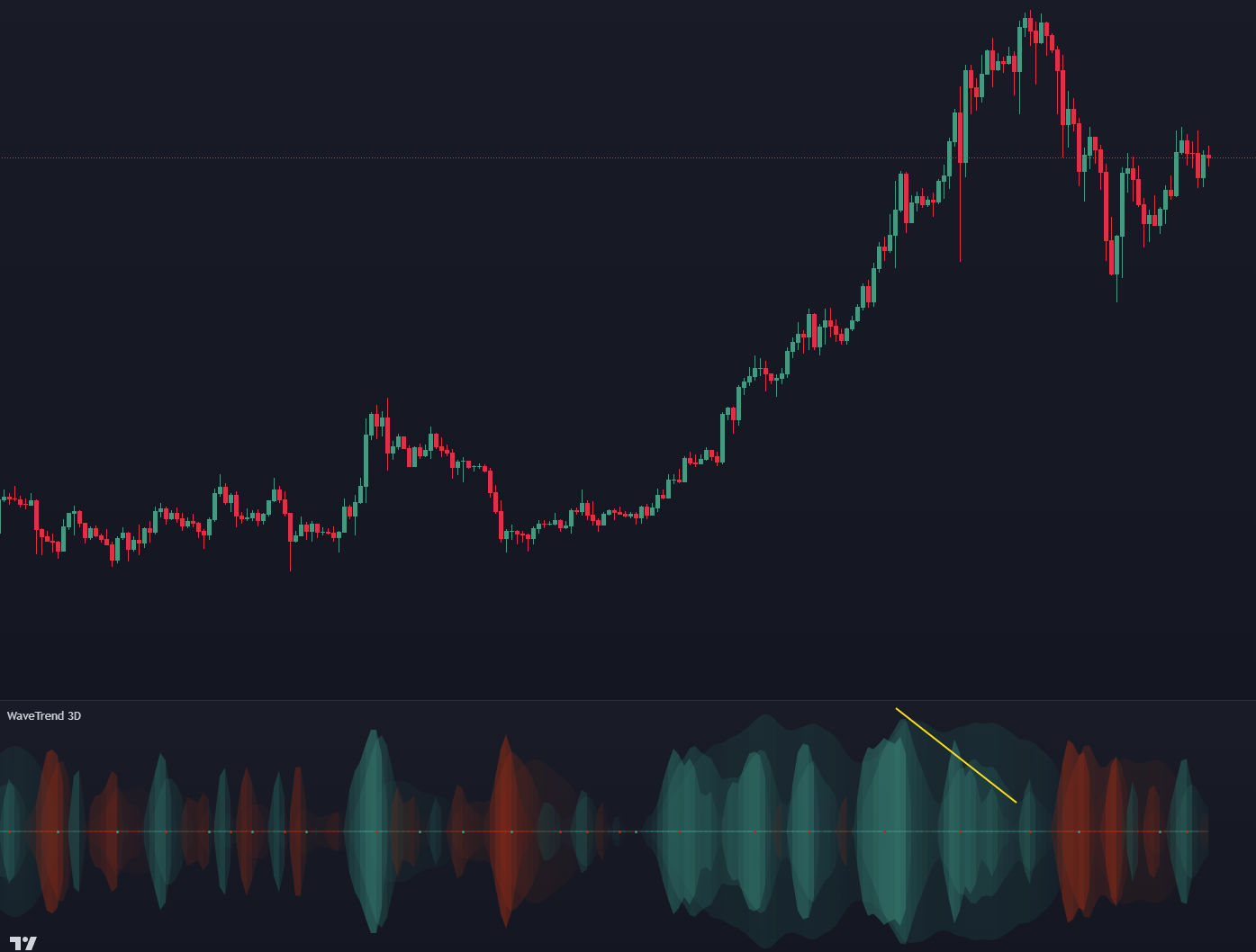
To get a better sense of where the actual trend is headed, it is necessary to look at this slower oscillator and basically try to determine if there's any simple harmonic patterns that you can latch onto. So that's why this slower oscillator is bolded by default is to kind of help your eyes, you know, always follow in relation to where that is heading because that definitely has the most gravity. So for example, when you are looking for whatever it is that you look for, whether it's a Batman symbol, a head and shoulders, a cup in handle, higher low, a lower high, you will see that as long as the circle that's being generated is in accordance with some sort of pattern, so for example, here is like a higher low, um, this is typically representative of a pretty good opportunity for an entry because as you can see, there was quite a bit of bullish momentum that played out after this happened because you had a higher low on a very slow time frame, the daily time frame, and meanwhile, these lower time frames like the sixth hour and the 12 hour were colliding with each other.
So when all of those stars aligned, it's usually a good sign. So that's just the general thought process that you can take for when you're trying to identify which circles are more significant than others.
WaveTrend 3D Big Circles
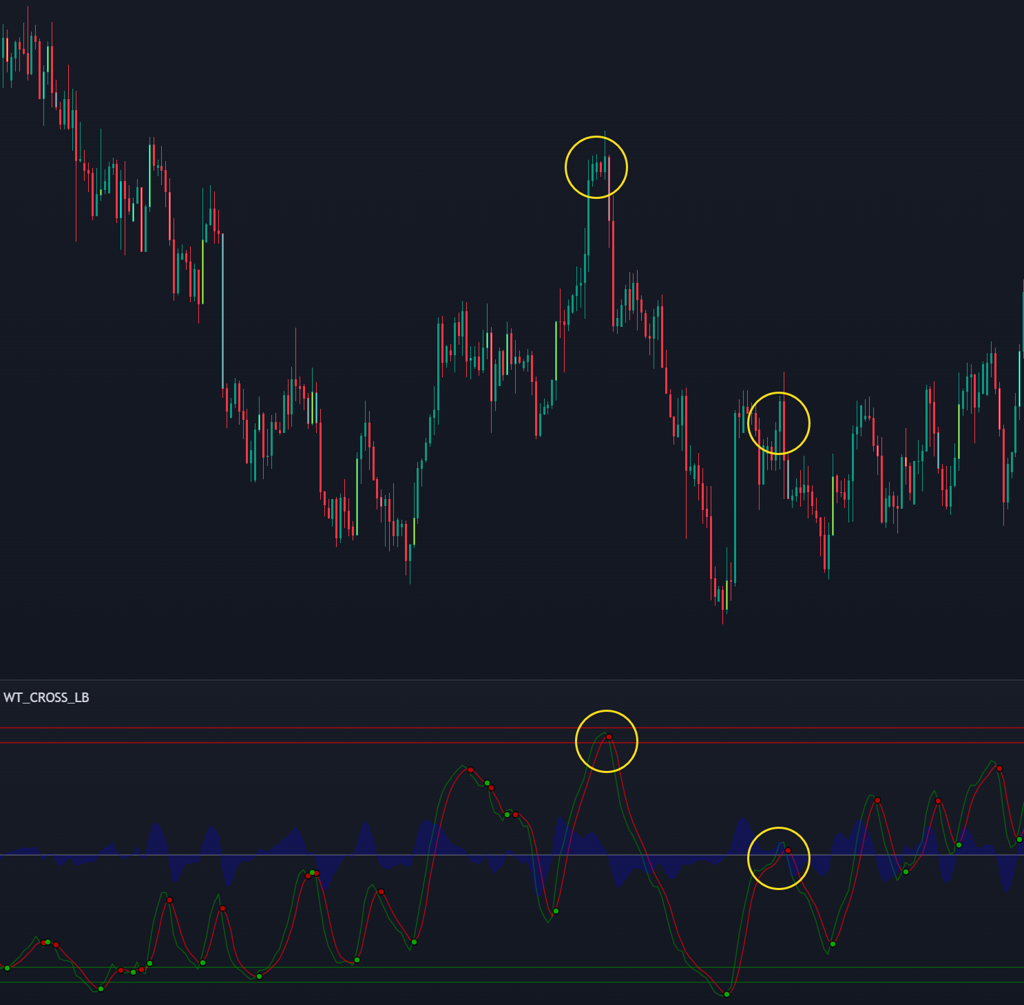
Why are some circles bigger than others? The reason for this is that some of these larger circles represent potential moments when there could be a possible trigger wave occurring for a specific divergence Which you can see below.
Here's an example for a bullish potential trigger wave that formed. You can see how, in relation to the previous circle that formed that it is 40% the size of the previous magnitude that generated a red circle. So whenever that happens, it's indicating that there is actually some weight behind this cross, and you might want to look at this a little bit closer because it could mean a pretty big movement. As you can see in this example it resulted in a big move upwards. These are usually pretty good indicators because it means that in general, there's a good amount of weight behind that particular cross.
WaveTrend 3D Mirrored Mode
The "Use Mirror" button will mirror the signals across the zero line. Why you would want to do this? You can make some interesting inferences based on how these waves are overlapping with each other.
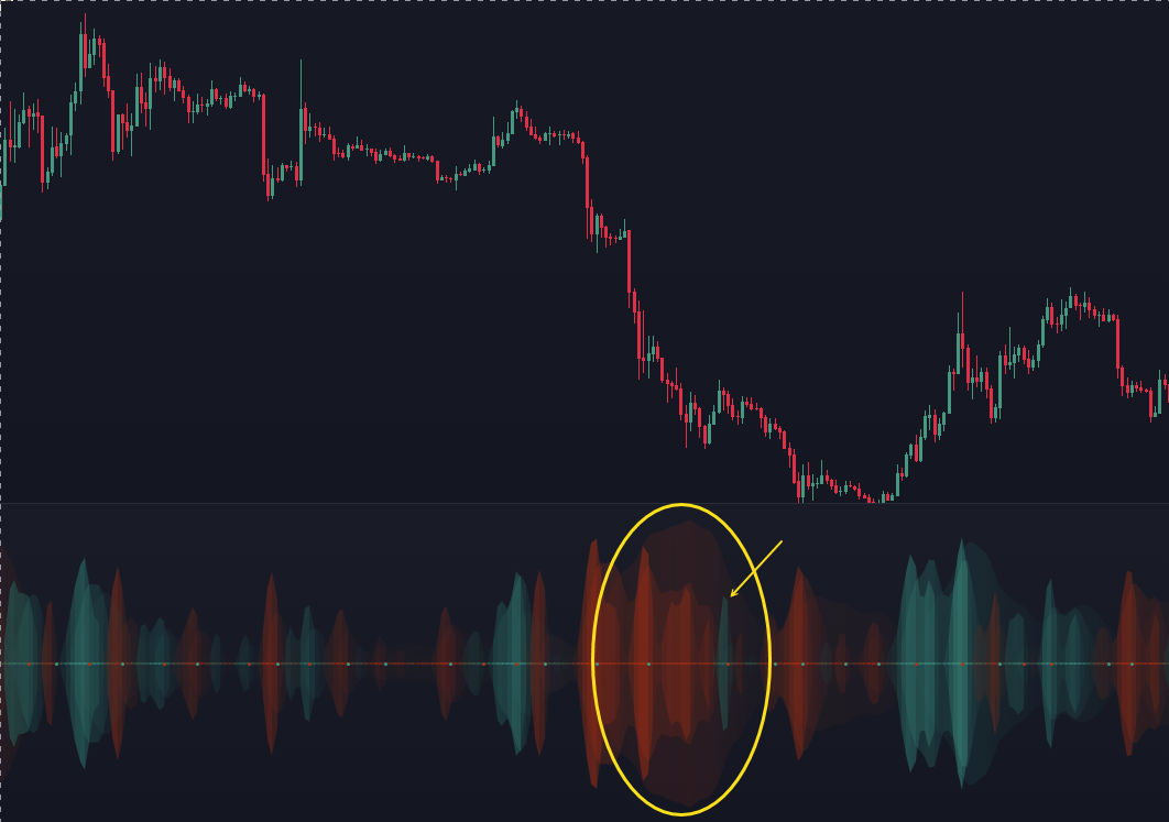
So you can see that within a larger bearish trend, there's little tiny bubbles of green showing you this is bullish, but you're still within a bearish environment. It kind of gives you a different way of thinking about things.
You can also, use it in a similar way to identify whenever a divergence is occurring. If there's a smaller green spike in relation to the last one. That usually means that bearish conditions are coming.
WaveTrend 3D EMA and CoG Smoothing
The other useful settings are definitely EMA Length and CoG Length. These are additional transformations that you can do to the signal to really smooth things out.
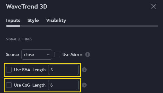
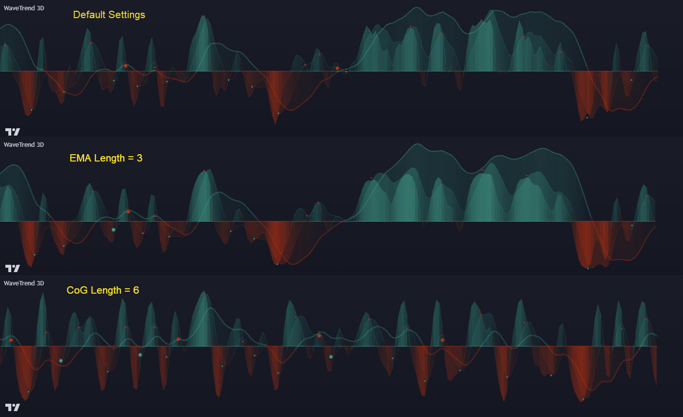
The more you increase the number, the more it will smooth them out. I encourage you to play with the Center of Gravity smoothing option. It's a great smoothing technique because it's zero lag, and it gives you some interesting ways of visualizing upcoming price movements because it looks so drastically different than even what it would look like if you don't use that smoothing.
WaveTrend 3D Speed to Emphasize
This setting will bold whatever speed you select to emphasize and then you can adjust the width of that particular signal to be more or less prominent.
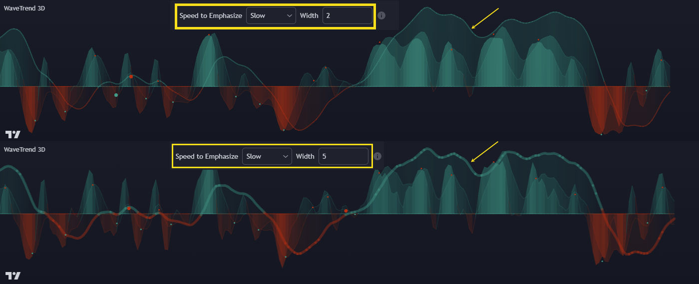
With the slow oscillator, you'll notice that it doesn't necessarily generate any circles, but whenever it does cross over this zero line, that's usually very significant as seen below.
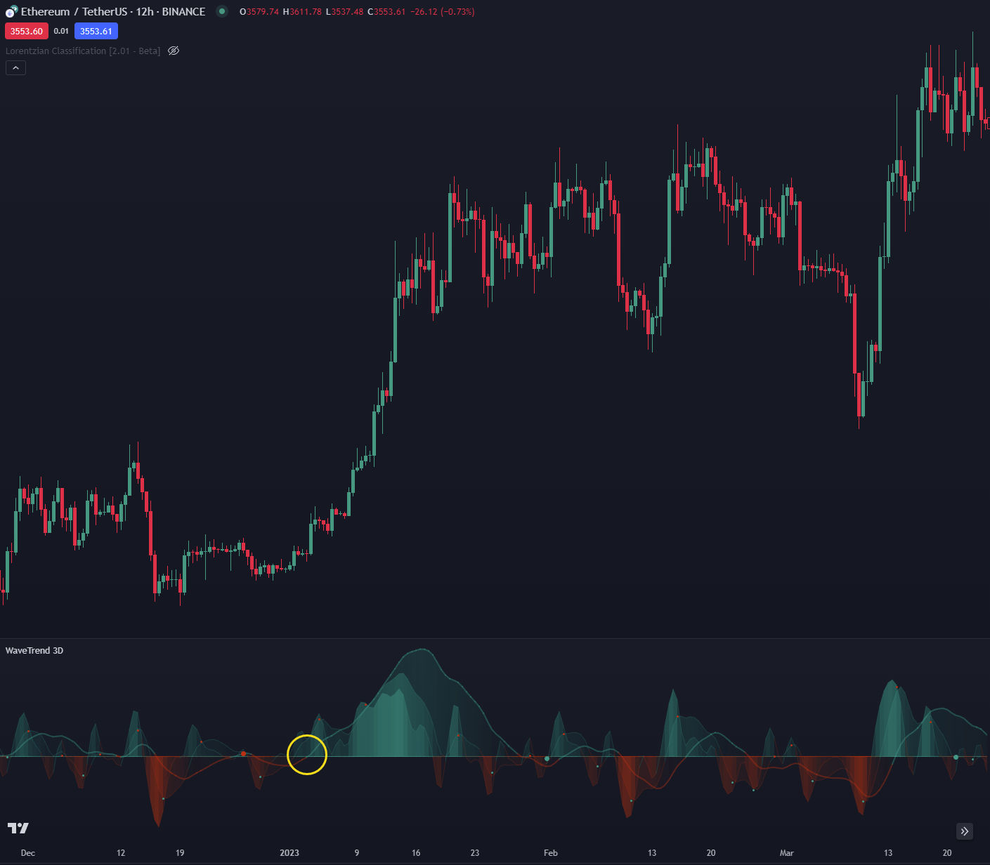
Whenever it manages to crossover the halfway point, that means there's going to be probably a trend change or something going on. You really have to keep an eye on this in relation to this median line, and that's why it's bolded be default.
To help you track it, you can enable the kernel estimators, and they do a pretty good job of showing you when it crosses over with the kernel estimate.
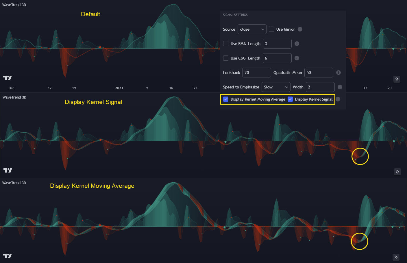
Kernel estimates are basically like a moving average but in my opinion, so much more powerful because they're a lot less lag and they're adaptive to whatever is happening. As you can see above, the "Display Kernel Moving Average is similar to the "Display Kernel Signal but it adds more width and you can see that even as it's going in a certain direction, the band will actually change colors, showing you what's happening.
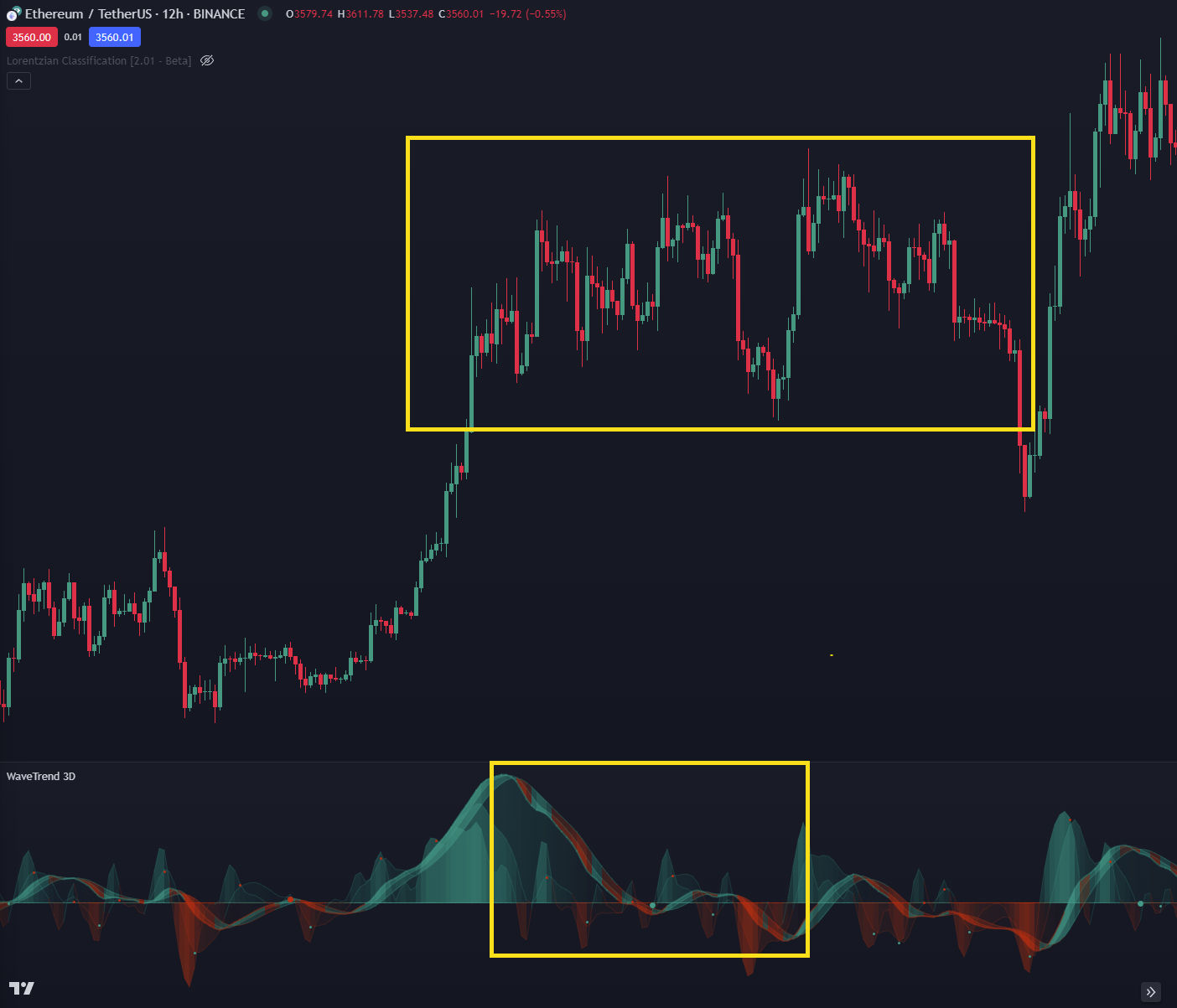
Typically, when you see like the changing colors frequently, that probably means you're in a ranging market as seen below.
The newest update to WaveTrend 3D is the addition of overbought and oversold zones.
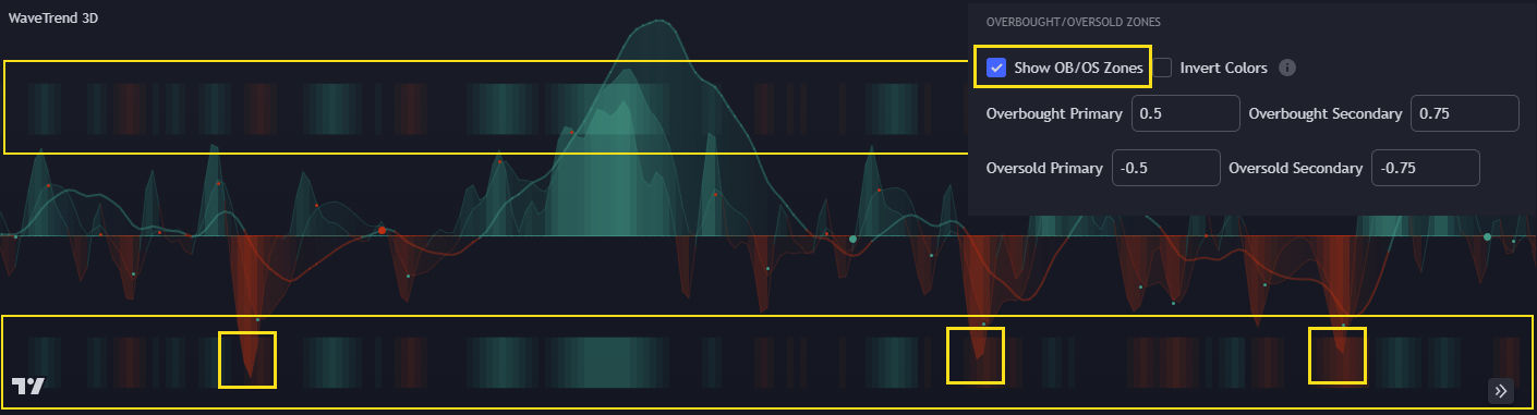
How this works is it starts at the 0.5 and negative 0.5 zone since everything is mapped between negative one and one, whenever it crosses that 0.5 mark, that means that's a pretty rare occurrence that only happens, less than 25% of the time. The rationale is that will typically represent a valid zone for a potential reversal and that's typically what happens. Keep in mind it is relative only to the normal oscillator, so I wouldn't necessarily judge it based on the fast with the slow oscillators. But in general, whenever the normal oscillator makes it up to there, it is typically time to reverse, either if not that second, then soon at least.
Settings (Tool Tips)
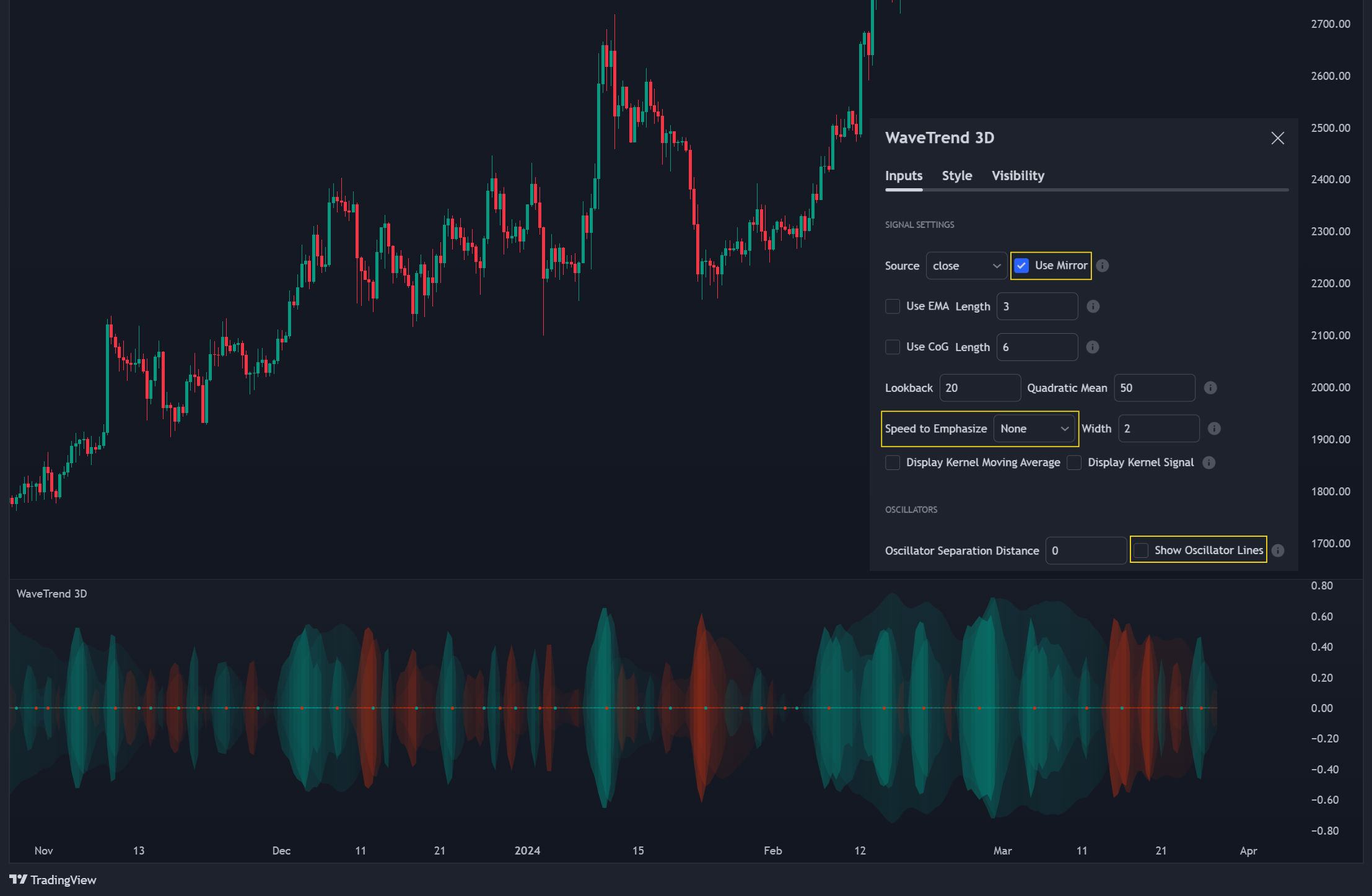
Source: The input series. Usually, it is the close or average price, but it can be any series Use Mirror: Whether to display a mirror image of the source series; for visualizing the series as a 3D waveform similar to a soundwave Use EMA: Whether to use an exponential moving average of the input series EMA Length: The length of the exponential moving average Use COG: Whether to use the center of gravity of the input series COG Length: The length of the center of gravity Speed to Emphasize: The target speed to emphasize Width: The width of the emphasized line Display Kernel Moving Average: Whether to display the kernel moving average of the signal. Like PCA, an unsupervised Machine Learning technique whereby neighboring vectors are projected onto the Principal Component Display Kernel Signal: Whether to display the kernel estimator for the emphasized line. Like the Kernel MA, it can show underlying shifts in bias within a more significant trend by the colors reflected on the ribbon itself Show Oscillator Lines: Whether to show the oscillator lines Offset: The offset of the emphasized oscillator plots Fast Length: The length scale factor for the fast oscillator Fast Smoothing: The smoothing scale factor for the fast oscillator Normal Length: The length scale factor for the normal oscillator Normal Smoothing: The smoothing scale factor for the normal frequency Slow Length: The length scale factor for the slow oscillator Slow Smoothing: The smoothing scale factor for the slow frequency Divergence Threshold: The number of bars for the divergence to be considered significant Trigger Wave Percent Size: How big the current wave should be relative to the previous wave Background Area Transparency Factor: Transparency factor for the background area Foreground Area Transparency Factor: Transparency factor for the foreground area Background Line Transparency Factor: Transparency factor for the background line Foreground Line Transparency Factor: Transparency factor for the foreground line Custom Transparency: Transparency of the custom colors Total Gradient Steps: The maximum amount of steps supported for a gradient calculation is 256 Fast Bullish Color: The color of the fast bullish line Normal Bullish Color: The color of the normal bullish line Slow Bullish Color: The color of the slow bullish line Fast Bearish Color: The color of the fast bearish line Normal Bearish Color: The color of the normal bearish line Slow Bearish Color: The color of the slow bearish line Bullish Divergence Signals: The color of the bullish divergence signals Bearish Divergence Signals: The color of the bearish divergence signals
Q & A
Q: Has WaveTrend 3D been ported Python?
A: WaveTrend 3D was ported to Python by Artnaz.
This is a Python Implementation of the "WaveTrend 3D" oscillator developed in TradingView (2022, Justin Dehorty). It is a great application of modern signal processing techniques to a well-known approach. The "3D" aspect refers to three dimensions that are calculated, each possibly representing a different timeframe. Arguably, it also refers to the three-dimensional visualisation, especially in "mirrored" form.
Q: What's the logic of plotting the crosses of WaveTrend 3D one candle prior to the actual cross?
A: It was purely an aesthetic decision since to directly associate the signals to their respective crosses rather than have them "floating" in space on the currently open bar. It's really important to keep in mind, though, that any cross from the previous bar is actually dependent on the current bar's relative closing, so if you find that confusing and don't mind floating signals in your indicator, then feel free to edit that offset to be zero.
Q: Does WaveTrend3D repaint?
A:The WaveTrend 3D indicator does not repaint in the traditional sense because it doesn't change its values after a bar has closed. However, it's important to understand that all indicators are susceptible to revisions in their values as new data becomes available, especially on lower timeframes. If you are concerned about repainting, it's recommended to use the indicator in conjunction with other forms of technical analysis and only act on signals when the bar has closed.
Q: How do the scaling and length settings alter the slow, normal, and fast oscillators for WaveTrend 3D?
A: The scaling and length settings in WaveTrend 3D can alter the slow, normal, and fast oscillators in the following ways:
-
Scaling: The scaling setting determines the range of values for the oscillators. Increasing the scaling value will expand the range and make the oscillators more sensitive to price movements. Decreasing the scaling value will narrow the range and make the oscillators less sensitive.
-
Length: The length setting determines the number of periods used in the calculation of the oscillators. Increasing the length value will result in smoother oscillators with less frequent changes in direction. Decreasing the length value will make the oscillators more responsive to recent price movements, resulting in more frequent changes in direction.
Both scaling and length settings can affect the number of signals generated by the oscillators. Higher scaling values and shorter length values tend to generate more signals, while lower scaling values and longer length values tend to generate fewer signals. It's important to note that the specific impact of these settings on the oscillators can vary depending on the market and timeframe being analyzed. Experimenting with different settings and conducting backtesting can help determine the optimal values for a particular trading strategy.